Hi STAMP peeps! I'm back again today, playing with the oh-so-fun Bloom Doodles and taking another look at color choices. Meet today's card.
A nearly-one-layer card made by masking, stamping and Copic coloring. Like my last spotlight project post. But with a different twist on the color wheel.
STEP 1
Gathered my supplies - stamps, Neenah 80 lb cardstock, Memento Copic-proof black ink, Copic markers.
Make a pencil oval on the panel to mark the area around which you want to stamp, leaving the middle blank for the sentiment later.

STEP 3

STEP 3
Stamp and mask and stamp and mask. (I actually saved the masks from my last Spotlight project.) I decided to use 7 blooms since odd numbers are pleasing to the eye. TIP: You probably already know this, but when you have stamps hanging over the edge of the panel (if you don't have the corner insert pieces to help out), move your panel to another corner of the MISTI or turn it upside down so you can still have two sides of your panel aligned with the edges of the MISTI but also accommodate the stamps hanging off the edge.
Stamped three images.
STEP 4
The big reveal after I also stamped some leaves over the masked images.
STEP 5
Erase the pencil line.
Consider colors. My first decision was to color the same images the same color, which meant for the larger images two on the left and two on the right. I opted to use blue and yellow for those and red for the three smaller blooms with gray for the centers and leaves. Although I probably would normally use yellow for the largest areas since it's the weakest of the three colors, this time I decided I wanted blue to be the dominant color.


STEP 6
So... the color wheel. The three primary colors on the wheel are blue, red and yellow. On the photo below on my little color wheel those would be the sections marked "P". For today's project I decided to go "one to the right" on my wheel and use blue-green, red-violet and yellow-orange. If you need a refresher about color wheel and which colors go together check this.
On my Copic marker chart I chose my blue-greens and then noticed that I had red-violet and yellow-orange combos on the same horizontal so I decided to go with those. Not sure if this is intentional in the Copic chart or not. But I thought the colors worked well together.
STEP 7
So then I got so into my coloring that I forgot to take photos! Until I reached this stage. In this photo you can see the nearly finished panel. All blooms are finished except for the yellow one on the upper left. It hasn't gotten a second coat of color yet...
STEP 8
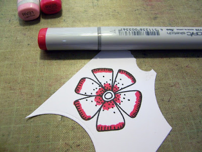
Now I do not claim to be a good Copic colorer, but for those of you wondering how I color... I stamped a bloom on scrap to color and try to explain...
Start with the darkest color (RV29) and do the outside edges and around the center.
Use the middle tone (RV25) over the darker one and extend it a bit more - from the outside edge of the petal toward the center and from the center toward the outside edge.
Use the lightest (RV21) over the other two, pulling color from the outside edge of the petal toward the center and from the center toward the outside edge.
STEP 9
It doesn't look too great yet. But have faith. Basically repeat the process. I've found that this second coat does the trick.
With the darkest color (RV29) go over the outside edges and around the center. I tend to come in toward the middle of the petal a bit more this time.
Use the middle tone (RV25) to blend the darker tone and extend it a bit more - from the outside edge of the petal toward the center and from the center toward the outside edge. This second coat of ink lets you soften the overlap better, although my marker choices 29, 25 and 21 are kinda far apart so harder to blend.
Use a liberal amount of the lightest (RV21) over the other two, pulling color from the outside edge of the petal toward the center and from the center toward the outside edge. This is where you can really achieve the blend.
To finish the card, I stamped the sentiment, adhered it to a black base and added a few sequins.
Hope you enjoyed my tutorials about experimenting with the color wheel. Should you try out any of the techniques from our Spotlight posts, be sure to hook up at our Spotlight Project Showcase.
Should you find yourself placing an order soon, I'd love it if you used my STAMPGIRLMARIA code for an additional 20% off!


I would love to try your coloring technique with my Zigs. I do not have Copics. Love how you achieved such beautiful highlights and dimension in your petals. Thank you for your color wheel instructions too. Thank you for the inspiration, my friend. Hugs..Nancy
ReplyDeleteBeautiful card! Great colors and coloring... thanks for the tutorial.
ReplyDeleteSuch a lovely card! Great colors and love how you did the flwoers!
ReplyDeleteGreat tutorial thanks, and a beautiful result
ReplyDeleteBlessings
Maxine
thanks for sharing the colours you have used, love the yellow and ohh the pink and the blue, it all looks so stunning.
ReplyDeletegorgeous card!
ReplyDeletehugs