



Showing posts with label Monika Skinner. Show all posts

Sunday, September 06, 2026

Perfect Pairs: Serene Winter with Monika

A beautiful winter card doesn't have to be complicated. When your stamps and ephemera already coordinate, a few simple design choices can be all it takes to create something special.

That's exactly what STAMPgirl Monika shows with these two cards featuring Perfect Pairs: Serene Winter

She used the coordinating stamps and ephemera cuts as her starting point, then added a little ink blending, repeat stamping, and a few carefully chosen finishing touches to create two cozy winter designs.


Create a Vintage Winter Feel

For her first card, Monika wanted to bring out the natural, vintage feel of the Serene Winter ephemera, so she started with a cream card base and lightly blended Old Paper Distress Ink over it. She then masked a narrow strip along the bottom of the card and repeat stamped the Winter definition stamp in Glamour Versafine Clair ink down the left side. 

Two coordinating ephemera pieces were layered together to create the focal point, and she stamped the Winter Wishes sentiment in Roasted Coffee Prism ink. A few Card Candi dots add to the vintage feel, while a sprinkle of glitter on the roof and twig gives the card just a touch of sparkle.

The result is warm, natural, and wonderfully wintry without needing a lot of layers.


Add Warmth to a Winter Palette

For her second card, Monika created another simple background by repeat stamping the Winter stamp, rotating it as she went. Instead of creating a straight border, she used unevenly masked, sloping lines to give the background a little more movement.

She then clustered coordinating ephemera pieces to complement the Winter Wishes sentiment. A single cup would have looked a little forlorn, so grouping the pieces together helps reinforce the cozy, social feeling of the sentiment.

She picked up the red beads in the ephemera to bring some warmth into the design, using red cardstock for the embossed sentiment and red Card Candi as a finishing touch.

I love how that small pop of red changes the feel of the card. Against all those warm neutral tones, it gives the design just enough color to keep it from feeling flat.


One Collection, Lots of Possibilities

Monika's two cards are a great example of how much variety you can get from a single Perfect Pairs collection. For the first card, she leaned into the natural, vintage feel of the ephemera with soft neutrals, red stamping, and a little sparkle. For the second, she created a more graphic background and used the red details in the ephemera to bring warmth into the design.

The coordinating stamps and ephemera cuts make it easy to get started, but small choices like your ink colors, how you repeat the background stamp, and which ephemera pieces you group together can completely change the finished card.

And you don't need a lot of extras to make those choices count. Sometimes a little color, a different stamping arrangement, or even an embellishment from your stash is all it takes.


Discover What's Possible

Perfect Pairs: Serene Winter combines coordinating stamps and ephemera cuts inspired by the quiet, cozy feel of winter. The collection gives you a ready-made starting point for creating cohesive cards, whether you're making a quick card or spending a little more time adding your own touches.

Choose an ephemera piece, add the coordinating background and sentiment, then play with the details. Try a different ink color, rotate the background stamp, cluster several pieces together, or add a little sparkle.

Serene Winter is one of four Perfect Pairs collections available in the STAMPlorations store, along with Blooms & Sunshine, Party & Wishes, and Classic Christmas.

Explore Serene Winter and the other Perfect Pairs collections and see where your creativity takes you.

Until next time, keep creating with confidence -- and let Perfect Pairs do the coordinating.


Monday, August 24, 2026

Perfect Pairs: Party & Wishes | Take the Pair and Build on It with Monika

Perfect Pairs gives you two things that already work well together: coordinating stamps and ephemera cuts. But you don't have to stop there.

For these two cards, STAMPgirl Monika took the Perfect Pairs: Party & Wishes collection and added ARTplorations stencils to create backgrounds that complement the ephemera without competing with it. And I really like how she kept the stenciling relatively simple so the party-themed images could take center stage.


Let Your Stencil Set the Party Mood


For her first card, Monika used the Confetti #1 slimline stencil to create a celebratory background for the candles ephemera. The stars and dots are perfect for a party card, but because the stencil pattern is fairly open, it doesn't overwhelm the colorful candles. She stamped the sentiment and a few sequins added the finishing touch.

Creative takeaway: Look at your stencils as background builders, not just the main attraction. A simple pattern can add just enough interest to make your focal image stand out.


Layer the Ephemera for a Big Impact

For her second card, Monika layered three Party & Wishes ephemera to create one big focal point. The gift package, cake, and party hat work together to make the card feel like one big celebration. Behind them, she kept things simple with the Dots All Over stencil, adding a soft pink dotted background that gives the white card base some interest without taking attention away from the ephemera. She finished the card with a white embossed sentiment, using just the "Celebrate" portion of the Celebrate Big sentiment stamp, along with a few sequins. I love how much impact she gets from simply layering three coordinating pieces.

Creative takeaway: Don't be afraid to layer or cluster several ephemera together. When the pieces already coordinate, they can make a really fun focal point without needing a lot of extra embellishment.


Take the Pair and Build on It

Monika's cards are a great example of what I mean when I say take the pair and build on itStart with the coordinating stamps and ephemera. Then look around your stash and ask yourself what else might work with them. A stencil. A few sequins. Another sentiment stamp. Maybe something completely unexpected.

And you don't have to save those "neutral" background stencils for a particular season or holiday, either. Dots and confetti work for birthdays, celebrations, congratulations, and so many other occasions.

That's the fun of building on a Perfect Pair. The pair gives you a starting point, but what you add to it is where your own style comes in.

Want to try Monika's approach? Check out Perfect Pairs: Party & Wishes in the STAMPlorations store and see what you can build around it.


Tuesday, August 18, 2026

Perfect Pairs | Party & Wishes with Monika

Celebrations don't always need a complicated card. Sometimes a few colorful pieces, a little stamping, and the right arrangement are all it takes to create something that feels festive and full of personality.

Today, STAMPgirl Monika is showcasing Perfect Pairs: Party & Wishes, pairing the coordinating stamps and ephemera cuts in two very different ways. One card turns the balloon bunch ephemera into an unexpected focal point with a clever twist, while the other uses the party-hats ephemera to create a playful, layered celebration card.

The beauty of Perfect Pairs is that the coordinating pieces give you a ready-made starting point while leaving plenty of room to make the designs your own.


Celebrate Big

For her first card, Monika used the colorful balloons ephemera and immediately saw something unexpected in their shape: a hot-air balloon. She made the balloons her focal point and used the Celebrate Big sentiment from the coordinating stamp set as the basket, white embossing it onto kraft cardstock. A hand-doodled line connects the sentiment to the balloons, while gold splatters and sequins add just the right amount of celebratory sparkle.

It's a clever example of looking at an embellishment for what it could become rather than what it was originally intended to be.

Creative takeaway: Look beyond the obvious when working with ephemera. Turn a shape, image, or small element in a different direction and see whether it suddenly suggests something else.


Party Hats and Confetti

For her second card, Monika wanted to capture a completely different celebration vibe: party hats, confetti, and streamers.

She randomly stamped the texture stamp from the Party & Wishes set across the card, masking areas as she went to create an energetic, layered background. Gold splatters and sequins become confetti, while the colorful party-hat Ephemera Cuts are arranged across the card to create movement.

The result feels joyful and spontaneous, with the elements scattered in a way that makes your eye move around the card rather than settling in just one place.

Creative takeaway: When you want to create a sense of movement, don't line everything up. Try varying the angle and placement of your focal elements, then use smaller details such as splatters or sequins to carry that movement throughout the design.


One Pair, Two Personalities

Monika's two cards are a great demonstration of what makes Perfect Pairs so versatile. The coordinating stamps and ephemera cuts give you the basic ingredients, but the finished cards can look completely different depending on how you arrange and combine them.

One card turns the ephemera into an unexpected focal image. The other builds an entire celebratory scene around it. And both came together quickly, proving that you don't need a huge supply list to create cards with plenty of personality.

If you haven't played with Perfect Pairs: Party & Wishes yet, this is a great set to experiment with. Start with the coordinating pieces, then see where your imagination takes them.

Until next time, keep creating and finding new possibilities in the supplies you already have.


Wednesday, August 12, 2026

words that matter | FOCUS + Retro People ATCs with Monika Skinner

Color can completely change the personality of a design.

Today, STAMPgirl Monika is back with three colorful, retro-inspired cards featuring the Simple Expressions: FOCUS stamps paired with Retro People ATCs.

In a previous post, Monika kept this same pairing stylish and sophisticated in black and white. This time, she brings in warm oranges, vibrant pinks, and fresh greens -- along with stamping, stenciling, and layered backgrounds -- to show just how different the same supplies can look with a change in color and approach.

Bold Color + Layers

For her first card, Monika went with a different card shape and a more regular frame around her Retro People ATC. The image itself is colored more boldly, allowing it to hold its own against the additional background stamping. She layered the ATC over orange cardstock and added botanical stamping that extends beyond the focal image. The FOCUS on the good sentiment overlaps the layers near the bottom, tying everything together. The combination of the bold image, orange background, and delicate line-art stamping creates a striking design with plenty of interest while keeping the retro image firmly in focus.

Let Your Scraps Lead the Way

Monika's second card started with a much softer, pencil-colored ATC. She wanted a background that wouldn't overwhelm the subtle coloring and, while searching through her orange cardstock for just the right shade, came across an almost-square scrap. Rather than trimming everything into a perfectly even frame, she worked with the piece as it was. That slightly irregular frame became part of the design and gave her the layered look she was after. It's a great reminder to play around with what you already have before reaching for something new. Sometimes an unexpected scrap, shape, or size can lead to a layout you might never have planned.


FOCUS on the Good Life

For her third card, Monika found inspiration right in the Retro People ATC image. The jars reminded her of making jams, chutneys, and preserving food -- and the renewed interest in growing and preserving your own food led to the sentiment FOCUS on the good LIFE.

There's also a bit of British humor tucked into the design. The sentiment is a nod to the sitcom The Good Life and its humorous take on the challenges of self-sufficiency in suburbia. To create her custom sentiment, Monika combined Simple Expressions: FOCUS with the word LIFE from the Bold Sentiments: Journey stamp set.

She created the layered background by partially stamping and ink blending with the solid FOCUS stamp, then stenciling another section with the Square Lots Square Stencil. The pattern is a subtle nod to garden trellis and homegrown food. Low-tack masking tape allowed her to isolate each area as she worked and build the different sections cleanly.


Creative Takeaway

Monika's two FOCUS features are a great example of how dramatically color can change the personality of the exact same supplies. Her earlier black-and-white cards were clean, graphic, and sophisticated. These colorful versions feel warmer, more playful, and unmistakably retro -- yet they all begin with the same Simple Expressions: FOCUS stamps and Retro People ATCs.

There's another useful idea here, too: let your supplies lead the design. A scrap of cardstock can inspire an unexpected layout. An image can suggest a completely new sentiment. A stencil pattern can reinforce the story behind a card.

You don't always need to have the entire design figured out before you start. Sometimes the most interesting ideas come from simply playing with what's already in front of you.


Discover What's Possible

Our Simple Expressions stamps were designed to make it easy to pair words that matter with the paper goods already in your stash. The solid and outline versions of each word give you even more ways to change the look and personality of your designs.

Pair any Simple Expressions stamp with a qualifying Paper Goods Pack and the paper goods are 40% off, making it a great time to experiment with your own combinations.

Until next time, keep creating with words that matter.


Sunday, August 09, 2026

words that matter | FOCUS + Retro People ATCs with Monika Skinner

Sometimes the simplest designs make the strongest statement.

Today, STAMPgirl Monika is back with three striking black-and-white cards featuring the Simple Expressions: FOCUS stamps paired with Retro People ATCs

With a limited color palette, minimal supplies, and a few clever techniques, she created three stylish cards that put the word itself right where it belongs -- in focus.

Putting FOCUS in Focus

For her first card, Monika turned the meaning of the word into part of the design. She stamped FOCUS repeatedly down the card, using softer gray impressions for most of the words and one strong black impression to immediately draw the eye. To create the faded effect, she used an older Versafine Onyx Black ink pad -- but you can easily recreate the look by stamping off onto scrap paper before making the second impression on your card. The black-and-white Retro People ATC fits beautifully into the graphic design, while another crisp black FOCUS impression overlaps the ATC. And there's a clever technique behind that seamless stamping.

Creative Tip

When you want a stamped image to cross over multiple layers without an obvious break, use a stamp-positioning tool. Monika first stamped FOCUS onto her card base and kept the stamp in position. After adding the ATC, she stamped again in exactly the same place. This allows FOCUS to visually continue across the different layers and creates a much more seamless result. I especially love how the technique reinforces the message of this card. Among all those softer, slightly "out-of-focus" words, your eye immediately lands on the one crisp black FOCUS.


Simple Lines, Big Impact

For her next two cards, Monika took an even more minimal approach. The first uses just three main elements: a Retro People ATC, the FOCUS on the good sentiment, and three embossed lines. She created the lines with a scoring board and scoring tool, adding subtle texture and structure without competing with the focal image. The lines also help visually anchor the ATC and sentiment. No scoring board? Monika suggests using a ruler and bone folder on the inside of the card front to create a similar effect.

Her final card uses the same basic design idea, but this time the lines are inked. Monika inked the edge of a ruler and used a second ruler as a guide to keep everything straight. Those three simple lines add just enough visual interest to connect the focal image and sentiment while preserving all that wonderful white space. Sometimes the simplest things really do make a difference.


Creative Takeaway

These three cards are a great reminder that simple doesn't have to mean plain. Monika used very few supplies, but small design choices -- changing the intensity of an ink impression, adding embossed lines, or introducing three thin inked lines -- give each card its own character.

They're also a wonderful example of letting a word inspire the actual design. On that first card especially, FOCUS isn't merely something you read. The contrast between the faded and crisp impressions makes you experience the idea visually. And paired with the timeless black-and-white Retro People ATCs, the result is graphic, stylish, and wonderfully cohesive.


Words That Matter

FOCUS on the good.

That's the message behind this Simple Expressions set, and it's one that can work especially well for encouragement, support, or those little handmade pep talks we sometimes want to send someone.

Simple Expressions stamps are also designed to pair easily with the paper goods you already love. Try FOCUS with ATCs as Monika has done here, or combine it with Card Fronts, Collage Sheets, Pocket Backdrops, or Ephemera Cut-Out Sheets to create your own coordinating cardmaking combinations.

And remember: when you purchase a Simple Expressions stamp, you can pair it with a qualifying Paper Goods Pack and the paper goods are automatically 40% off.

Until next time, keep creating with words that matter.


Friday, August 07, 2026

Creative Tip of the Day | 3 Ways to Make Your Dies Work Harder

Sometimes the best creative inspiration comes from taking another look at supplies we already have.

For today's Creative Tip of the Day, we're revisiting three projects from the STAMPlorations archives by STAMPgirls Monika, Shirley, and Vicki. Each card uses CUTplorations dies in a completely different way -- and together, they're a great reminder that a die can do much more than simply create an embellishment.

Creative Tip: Look Beyond the Obvious

When you pull out a die, don't feel limited by its most obvious use. A die-cut can add texture to a background, become a repeated design element, or take center stage as the focal point of your card. Here are three ways our STAMPgirls did exactly that.

1. Add Texture + Pattern with a Border Die

On Monika's beautiful floral card, the Art Border #3 Die creates a delicate patterned panel behind the flowers. Rather than competing with the focal image, all those tiny die-cut details add texture and interest while still allowing the flowers to shine.

Creative lesson: Detailed border dies don't have to be the star of the card. Try using them as supporting layers whenever a background needs a little something extra.


2. Turn a Die-Cut into Your Own Pattern

Shirley took a completely different approach with the Dragonfly Layering Dies. Instead of using all the layers, she used the solid dragonfly shape repeatedly across that fabulous orange background. The repetition transforms a single die-cut shape into an all-over pattern  -- almost like creating your own patterned paper.

Creative lesson: Layering dies don't always have to be layered! Try using just one component repeatedly to create a completely different look.


3. Let a Silhouette Take Center Stage

Vicki's card shows just how powerful a simple silhouette can be. The Perched Bird Die becomes the focal point against the large glowing circle and dramatic black background. There aren't a lot of elements competing for attention, so that recognizable silhouette gets to do all the work.

Creative lesson: Sometimes a strong die-cut shape is all you need. Pair a silhouette with a bold background or simple geometric shape and let it become the star.


Why We Love It

These three projects couldn't look more different, but they all demonstrate the versatility of dies. A die can be a background. It can become a pattern. It can be the focal point. So the next time you reach for one of your dies, instead of asking, What is this die supposed to do? try asking: What else could I do with it? You might discover an entirely new way to use something that's been sitting in your stash for years.


Rediscover Your CUTplorations Dies

If these projects have you wanting to play with dies again, August is a great time to do it. All CUTplorations thin metal dies are instantly 15% off throughout August -- no code needed.

Take another look through the CUTplorations collection and see what new possibilities you can discover.

Until next time, keep creating and discovering what's possible with the supplies you already love.


Sunday, July 19, 2026

Creative Inspiration | Clean & Playful with Monika

One of my favorite things about our Never-Ending Anything Goes Challenge is exactly what the name suggests: anything goes. Every month we see so many different styles, techniques, and creative interpretations in our community, and today's projects from STAMPgirl Monika are a wonderful reminder that there's no single "right" way to create.

Although these two cards are completely different in style, both beautifully showcase how a simple idea can come to life in its own unique way.

Monika's first card features the Layered Stars stamp set. I love the elegant simplicity of this slimline design. The delicate border of stars frames the card beautifully, while the softly colored layered star naturally draws the eye. Paired with the graceful "Wish upon a Star" sentiment, the finished design feels peaceful, timeless, and beautifully balanced.


Her second card takes a much more playful approach. Using the Artsy Tribal Doodles stamp set, Monika created a whimsical flower from repeated stamped images, resulting in a bright, cheerful focal point full of movement and personality. She finished the design with the inspiring sentiment from the True and Free stamp set: "Happiness held is the seed; happiness shared is the flower." I love how perfectly the sentiment complements the hand-stamped bloom.

Creative Takeaway

Monika's cards remind us there isn't just one creative style to aspire to. One card embraces clean lines and generous white space, while the other celebrates playful repetition and bold color. Both are equally successful because each design stays true to its own style.

That's the beauty of creativity -- and exactly why our Never-Ending Anything Goes Challenge welcomes every maker, every technique, and every creative voice.

Join the Fun!

Feeling inspired? We'd love to see what you're creating! Our Never-Ending Anything Goes Challenge is open year-round, so whenever creativity strikes, you can share your latest handmade project with us.

Whether your style is clean and simple, layered and artsy, or somewhere in between, we'd love for you to join us. Every project is another opportunity to inspire fellow makers and celebrate the joy of creating together.

If either of Monika's cards has sparked an idea, we'd love to see where your creativity takes you.

Happy creating, and we can't wait to see what you make!


Tuesday, July 07, 2026

Retro Inspiration: You're Not Old, You're Vintage!

Hello again, STAMPfriends!

Are you looking for a fun spark of inspiration to get your creativity flowing today? We have a gorgeous, retro-themed project to share by the talented Monika that is sure to bring a smile to your face!

Monika perfectly combined vintage flair with vibrant color blocking to create a truly eye-catching design. 

Monika’s Vintage Jukebox Card

For her project, Monika started by creating a stunning backdrop. She ink-blended soft, vibrant blue ink through our Bubbles stencil onto a white card front, leaving a beautifully textured patterned background.

For her main focal point, she used a wonderfully detailed vintage jukebox image from the Nostalgia #1 Ephemera Cut-Outs, layering it against a dark paper panel to really make the warm yellow and orange tones pop. To finish off the card, she added a perfectly playful sentiment from the Nostalgic #1 clear stickers that reads, "you're not old, you're vintage."


Join Our Never-Ending Anything Goes Challenge!

Inspired to create your own crafty masterpiece? We would love to see it! Monika's project is the perfect reminder to come play along with us in our ongoing community showcase.

Before you link up your project, just remember our golden rule: STAMPlorations products must be the focal point or "star" of your creation! You are more than welcome to mix in basic supplies or shape dies from other companies for your card panels and layers, but your STAMPlorations stamps, stencils, ephemera, OR sentiments need to be the main feature.

Don't own any of our products yet? No worries at all! Every single month, we offer a free digital stamp on the challenge page so anyone can download it, create a project, and join the fun for a chance to win a $15 shop code!

👉 Click Here to Enter the Never-Ending Anything Goes Challenge!

What will you create this week? Happy crafting, and we can't wait to see your entries!

Wednesday, May 13, 2026

Stamping in Style: Monika's Artistic Storage Solution

Hello, STAMPfriends! Today we have a wonderful piece of inspiration from Monika, who has turned a practical storage item into a beautiful work of art. Using papers from the Artistic Crafter's Collage Paper collection, she transformed a simple chipboard holder into the perfect home for her favorite STAMPlorations stamps.


Tuesday, April 28, 2026

Creative Tip of the Day: Selective Stenciling & Double Die Layers

Today’s project by Monika is a masterclass in "less is more." By using strategic placement and clever layering, she created a card that feels both airy and impactful.


The Technique

This look is achieved by selective stenciling and die-cut layering. By only stenciling a portion of the background with the Wheels slimline stencil, you create a modern, asymmetrical balance. When you top that with a white-on-white layered butterfly using the Flutter Zen #1 layering dies, the result is pure elegance.
Friday, April 24, 2026

Creative Tip of the Day: Spot Coloring with Selective Die Cutting

Welcome back to our series where we revisit classic projects from our talented design team! Whether you're a long-time fan or a new follower, these bite-sized tips are designed to spark your creativity and help you get the most out of your STAMPlorations supplies.

Today, we're looking at a stunning clean and simple card by Monika Skinner. She demonstrates how a small focused area of color can make a massive impact against a black-and-white background.


The Technique: Spot Coloring on Die Cuts 

Tuesday, April 21, 2026

Creative Tip of the Day: Selective Inking with Geometric Stencils

We're back with another Creative Tip of the Day, where we take a closer look at the clever techniques the STAMPgirls use to bring their projects to life. Today, we’re revisiting a beautiful card by Monika that perfectly balances bold geometric patterns with delicate florals. Whether you're looking to refresh your layout skills or find new ways to use your favorite stencils, this "spotlight" technique is a wonderful one to have in your creative toolkit. 🌸✨


Coffee & Creativity: A Caffeinated Showcase with Monika Skinner

If you're a fan of cozy cafes and the rich aroma of freshly roasted beans, you’re going to love our featured projects today. STAMPgirl Monika Skinner has been busy in her craft room, and she'll share with us how versatile The Coffee House collage papers can be. From home decor pieces to elegant cards, these papers offer the perfect blend of watercolor illustrations and high-texture patterns to ground any design. ☕✨

Coffee Bean Heart Coaster


Friday, April 17, 2026

Monika Captures Coastal Memories with Botanical Beats 🌊🌸

Welcome back to the blog! Today, we're sharing a super-cool mini album project by Monika that perfectly blends travel memories with artistic layers. If you’ve been looking for a way to document your favorite getaways, this project is sure to inspire you! 🎨✨

A Look Into Monika’s Botanical Mini Album

Monika took us on a virtual trip to the Llyn Peninsula in North Wales through her beautiful handmade mini album. Using the bold blooms and butterfly imagery from the Botanical Beats collage paper pack, she created a vibrant backdrop for her personal photos. 🦋📸

Here are the highlights of her coastal-inspired creation:


Monday, March 09, 2026

Vintage Dreams & Botanical Blooms: A Mini Book Masterpiece by Monika🌸✨

Hello, STAMPfriends! I (Shery) have been swooning over the latest inspiration from the talented Monika. Her recent mini book project is a masterclass in soft, romantic layering and vintage-inspired design. At the heart of her creation is the Faded Botanicals collage paper pack—a dreamy collection of script, florals, and weathered textures that provides the perfect "old-world" foundation for any mixed-media project. Even better? This stunning paper pack is a lead feature in our curated The Botanical Maker's Trio, making it easier than ever to achieve this cohesive, ethereal look.

Monika's mini scrapbook/journal starts strong with two incredible cover designs that set a beautiful, vintage-inspired tone.

Wednesday, March 16, 2022

{Spotlight Project} Monika Tries Spotlight Stencilling


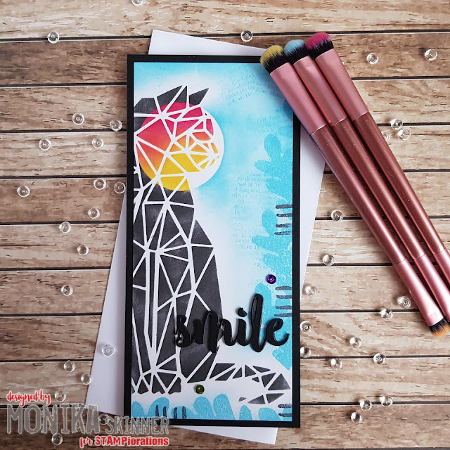
Hi STAMPlorations Friends! Having been musing what to do for this month's post, I wondered how it might be possible to adapt the spotlight colouring technique for stamped images to stencilled images and patterns. Have a look at what I came up with.


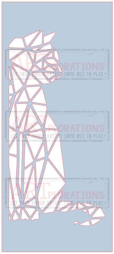
The Kitty slimline stencil seemed to be a good one to colour in grey and try to spotlight the face with brighter colours. That was the plan.

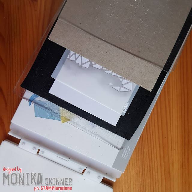
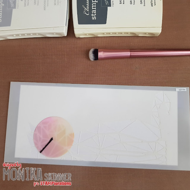
Before starting applying colour, I decided to dry emboss kitty first. Below is the sandwich I used for my big shot: platform without shims - clear cutting plate - black rubber mat - piece of card to emboss - Kitty stencil - a piece of plain card to avoid my worn plate imprinting on my embossed stencil image - clear cutting plate


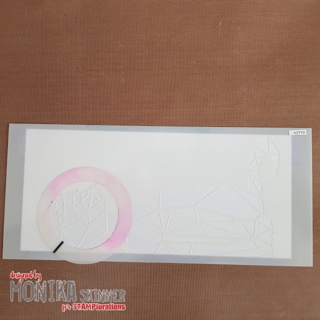
Leaving the stencil aligned with my embossed kitty, I picked the smallest ring from the Circles Flexi-Template, attached it in place with repositionable double sided tape and applied Daffodil Delight and Melon Mambo inks within the circle only.


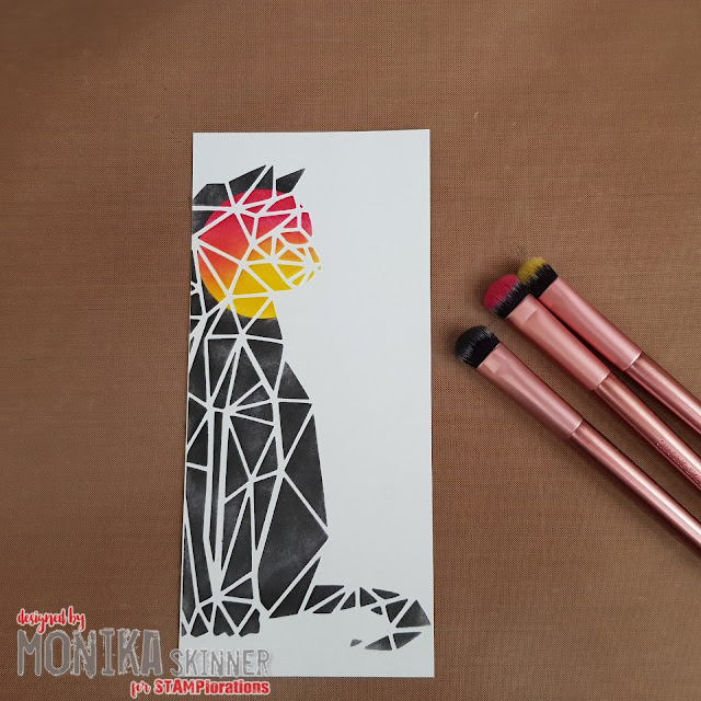
I used the circle from the template as mask and started applying grey ink. I had to go with the darker Basic Gray, the Smoky Slate was simply too light. Originally I had planned to use a mix of both.


This is how it turned out after the stencil and template mask were removed. The small brushes are the makeup brushes I used for applying the colour.


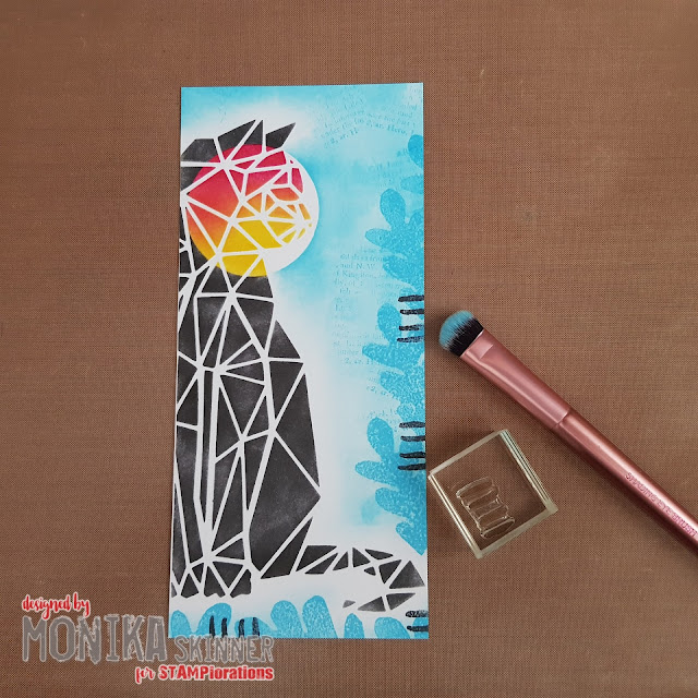
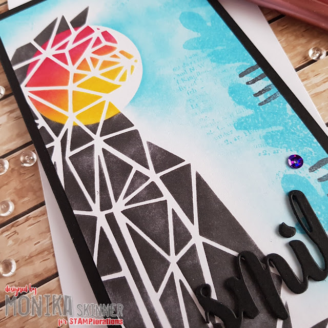
I could have used kitty just like that and maybe added a few splatters, but I wanted to see how it would turn out with the circle completed. The circle mask went back on and I blended a bit of Tempting Turquoise for added colour. A bit of stamping was added around the edge using stamps from the Art Marks 3 set before finishing off with a die-cut sentiment and a couple of sequins.


I rather liked how my experiment turned out. It will certainly be a technique to add to my toolbox.


***************

These are the products I used from the STAMPlorations Shop to make my card.


That's it from me for today. Wishing you a lovely week.
hugs
Monika ❤

Thursday, February 03, 2022

{Spotlight Project} Watercolour Vellum Flowers With Monika


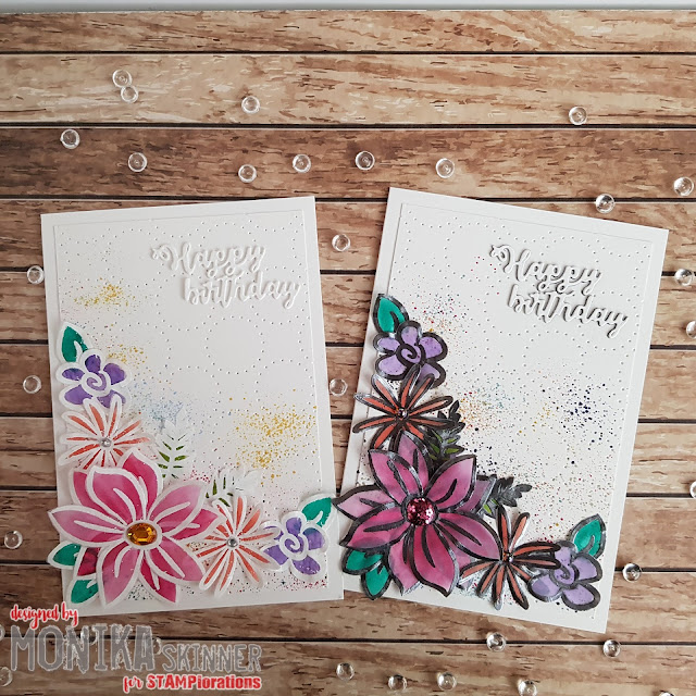
Hi STAMPlorations Friends! Embossed and watercoloured vellum makes for very delicate flowers you can use in your projects. Here are a couple of cards I made.


Thursday, January 06, 2022

{Spotlight Project} Heart Balloon to Butterfly with Monika


Hi STAMPlorations Friends! Welcome to my first Spotlight project of 2022. When I recently rearranged my craft space I found some die-cut balloons with their negative cuts which I had kept for future use.

Today's project tutorial makes good use of the inner negative cut from the balloon frame. Have a look.


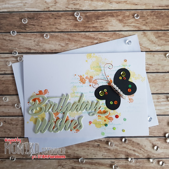
Well, I turned them into a butterfly. Here is how my project came together.